Page 2 of 3
Re: Restored and Updated MAGNA 10E Owners Guide 2016
Posted: Thu Jun 02, 2016 1:52 am
by everettdavis
JPG wrote:FWIW, I find the 'light' blue less legible than black. Perhaps a darker blue?
Your relocating them is a great improvement. *
I doubt many here realize the amount of time and effort this takes.
* fact, not a humble opinion!

James
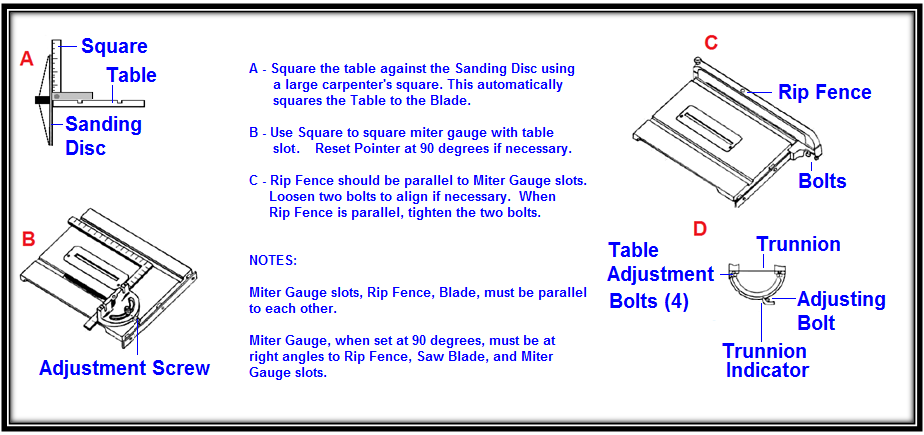
What do you think of this color blue?
Everett
- FIG 16.png (77.71 KiB) Viewed 4387 times
Re: Restored and Updated MAGNA 10E Owners Guide 2016
Posted: Thu Jun 02, 2016 2:23 am
by JPG
An improvement to my eyes.
I would like Charlese to chime in here also for reasons he and I both know.
Re: Restored and Updated MAGNA 10E Owners Guide 2016
Posted: Thu Jun 02, 2016 3:23 pm
by everettdavis
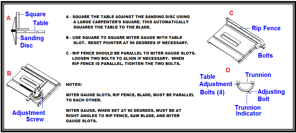
I think I am going to take the narrative text in this illustration to black and possibly in all caps.
I will leave the labels in color.
Do I need to darken the blue more? This one is RGB 0,0,255
Everett
Re: Restored and Updated MAGNA 10E Owners Guide 2016
Posted: Thu Jun 02, 2016 3:42 pm
by dusty
Everett, all of what you have presented here on the forum has been excellent. A great tribute to the equipment you have featured.
As far as the color, this blue is perfect. Another opinion.
Re: Restored and Updated MAGNA 10E Owners Guide 2016
Posted: Thu Jun 02, 2016 10:53 pm
by JPG
everettdavis wrote:I think I am going to take the narrative text in this illustration to black and possibly in all caps.
I will leave the labels in color.
Do I need to darken the blue more? This one is RGB 0,0,255
Everett
I agree! All caps is not necessary. Save that for when attention grab is needed. 0.0.255 is good!
Re: Restored and Updated MAGNA 10E Owners Guide 2016
Posted: Thu Jun 02, 2016 11:39 pm
by everettdavis
Finally got some time to make that change. Preferences?
Everett
- FIG 16 blue and black.png (79.55 KiB) Viewed 4275 times
Re: Restored and Updated MAGNA 10E Owners Guide 2016
Posted: Thu Jun 02, 2016 11:40 pm
by BuckeyeDennis
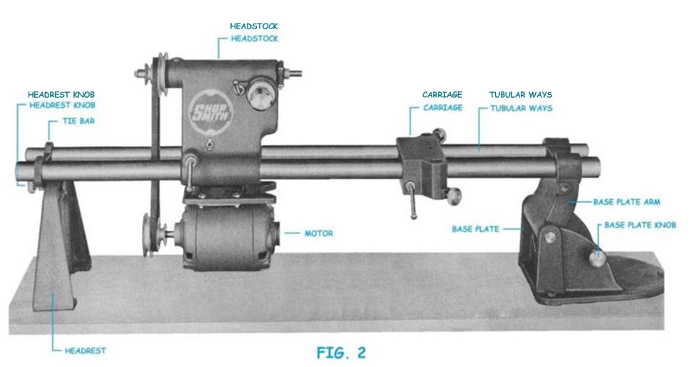
I'm going to be a contrarian here. I think that the original teal color is much more elegant than the proposed blue. But I agree that a little more contrast with the white background would make for easier reading.
So why not just darken it up a bit? I tried to do just that in the image below, with a font color of 0/120/140 on the inserted callouts.
- Darker teal.JPG (53.03 KiB) Viewed 4275 times
Re: Restored and Updated MAGNA 10E Owners Guide 2016
Posted: Thu Jun 02, 2016 11:51 pm
by JPG
BuckeyeDennis wrote:I'm going to be a contrarian here. I think that the original teal color is much more elegant than the proposed blue. But I agree that a little more contrast with the white background would make for easier reading.
So why not just darken it up a bit? I tried to do just that in the image below, with a font color of 0/120/140 on the inserted callouts.
Darker teal.JPG
That'll do!

Re: Restored and Updated MAGNA 10E Owners Guide 2016
Posted: Fri Jun 03, 2016 12:08 am
by ERLover
I think it is all better then original, kudos for your work. "Looking for perfection just gets you to cut off your ear" Van Gouh!!!
Re: Restored and Updated MAGNA 10E Owners Guide 2016
Posted: Fri Jun 03, 2016 12:22 am
by everettdavis
I don't want to cut off my ear, or my ER... but to ERR is human.
Thanks for everyone's input, and I have had some folks here looking at it as well. I am going with the 0,0,255 Blue as it has garnered by far the most comments on overall legibility with some color challenged folks.
It is going to take some time, but it will be similar in quality to the 10E I did earlier if all things go as expected.
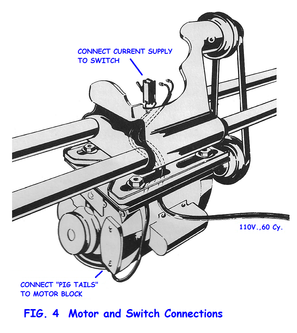
Here's Figure 4 for example.
Everett
- Fig 04.png (573.56 KiB) Viewed 4264 times
I have moved to PNG from the JPG format as each time I did a change, I got a color shift and bleeding with each revision, making corrections odd looking and color drifts between revisions. Hopefully PNG format will not exhibit that.