Restored and Updated MAGNA 10E Owners Guide 2016

Forum for Maintenance and Repair topics. Feel free to ask questions or contribute.

Moderator: admin

User avatar
everettdavis
Platinum Member
Posts: 2163
Joined: Thu Jul 17, 2014 11:49 am
Location: Lubbock, TX

Re: Restored and Updated MAGNA 10E Owners Guide 2016

Post by everettdavis »

JPG wrote:FWIW, I find the 'light' blue less legible than black. Perhaps a darker blue?

Your relocating them is a great improvement. *

I doubt many here realize the amount of time and effort this takes.

* fact, not a humble opinion! :D
James

What do you think of this color blue?

Everett
FIG 16.png
FIG 16.png (77.71 KiB) Viewed 4390 times
User avatar
JPG
Platinum Member
Posts: 35600
Joined: Wed Dec 10, 2008 7:42 pm
Location: Lexington, Ky (TAMECAT territory)

Re: Restored and Updated MAGNA 10E Owners Guide 2016

Post by JPG »

An improvement to my eyes.

I would like Charlese to chime in here also for reasons he and I both know.
╔═══╗
╟JPG ╢
╚═══╝

Goldie(Bought New SN 377425)/4" jointer/6" beltsander/12" planer/stripsander/bandsaw/powerstation /Scroll saw/Jig saw /Craftsman 10" ras/Craftsman 6" thicknessplaner/ Dayton10"tablesaw(restoredfromneighborstrashpile)/ Mark VII restoration in 'progress'/ 10
E[/size](SN E3779) restoration in progress, a 510 on the back burner and a growing pile of items to be eventually returned to useful life. - aka Red Grange
User avatar
everettdavis
Platinum Member
Posts: 2163
Joined: Thu Jul 17, 2014 11:49 am
Location: Lubbock, TX

Re: Restored and Updated MAGNA 10E Owners Guide 2016

Post by everettdavis »

I think I am going to take the narrative text in this illustration to black and possibly in all caps.

I will leave the labels in color.

Do I need to darken the blue more? This one is RGB 0,0,255

Everett
User avatar
dusty
Platinum Member
Posts: 21530
Joined: Wed Nov 22, 2006 6:52 am
Location: Tucson (Wildcat Country), Arizona

Re: Restored and Updated MAGNA 10E Owners Guide 2016

Post by dusty »

Everett, all of what you have presented here on the forum has been excellent. A great tribute to the equipment you have featured.

As far as the color, this blue is perfect. Another opinion.
"Making Sawdust Safely"
Dusty
Sent from my Dell XPS using Firefox.
User avatar
JPG
Platinum Member
Posts: 35600
Joined: Wed Dec 10, 2008 7:42 pm
Location: Lexington, Ky (TAMECAT territory)

Re: Restored and Updated MAGNA 10E Owners Guide 2016

Post by JPG »

everettdavis wrote:I think I am going to take the narrative text in this illustration to black and possibly in all caps.

I will leave the labels in color.

Do I need to darken the blue more? This one is RGB 0,0,255

Everett
I agree! All caps is not necessary. Save that for when attention grab is needed. 0.0.255 is good!
╔═══╗
╟JPG ╢
╚═══╝

Goldie(Bought New SN 377425)/4" jointer/6" beltsander/12" planer/stripsander/bandsaw/powerstation /Scroll saw/Jig saw /Craftsman 10" ras/Craftsman 6" thicknessplaner/ Dayton10"tablesaw(restoredfromneighborstrashpile)/ Mark VII restoration in 'progress'/ 10
E[/size](SN E3779) restoration in progress, a 510 on the back burner and a growing pile of items to be eventually returned to useful life. - aka Red Grange
User avatar
everettdavis
Platinum Member
Posts: 2163
Joined: Thu Jul 17, 2014 11:49 am
Location: Lubbock, TX

Re: Restored and Updated MAGNA 10E Owners Guide 2016

Post by everettdavis »

Finally got some time to make that change. Preferences?

Everett
FIG 16 blue and black.png
FIG 16 blue and black.png (79.55 KiB) Viewed 4278 times
User avatar
BuckeyeDennis
Platinum Member
Posts: 3814
Joined: Tue Jul 24, 2012 10:03 pm
Location: Central Ohio

Re: Restored and Updated MAGNA 10E Owners Guide 2016

Post by BuckeyeDennis »

I'm going to be a contrarian here. I think that the original teal color is much more elegant than the proposed blue. But I agree that a little more contrast with the white background would make for easier reading.

So why not just darken it up a bit? I tried to do just that in the image below, with a font color of 0/120/140 on the inserted callouts.
Darker teal.JPG
Darker teal.JPG (53.03 KiB) Viewed 4278 times
User avatar
JPG
Platinum Member
Posts: 35600
Joined: Wed Dec 10, 2008 7:42 pm
Location: Lexington, Ky (TAMECAT territory)

Re: Restored and Updated MAGNA 10E Owners Guide 2016

Post by JPG »

BuckeyeDennis wrote:I'm going to be a contrarian here. I think that the original teal color is much more elegant than the proposed blue. But I agree that a little more contrast with the white background would make for easier reading.

So why not just darken it up a bit? I tried to do just that in the image below, with a font color of 0/120/140 on the inserted callouts.
Darker teal.JPG

That'll do! :cool:
╔═══╗
╟JPG ╢
╚═══╝

Goldie(Bought New SN 377425)/4" jointer/6" beltsander/12" planer/stripsander/bandsaw/powerstation /Scroll saw/Jig saw /Craftsman 10" ras/Craftsman 6" thicknessplaner/ Dayton10"tablesaw(restoredfromneighborstrashpile)/ Mark VII restoration in 'progress'/ 10
E[/size](SN E3779) restoration in progress, a 510 on the back burner and a growing pile of items to be eventually returned to useful life. - aka Red Grange
ERLover
Platinum Member
Posts: 3914
Joined: Mon Aug 31, 2015 10:19 pm
Location: Greenie and Goldie Country not to metion the WI Badgers!

Re: Restored and Updated MAGNA 10E Owners Guide 2016

Post by ERLover »

I think it is all better then original, kudos for your work. "Looking for perfection just gets you to cut off your ear" Van Gouh!!!
KNOWLEDGE AND EXPERIENCE EQUALS WISDOM. Albert Einstein
The Greatness officially starts :D :D :D :D :D :D
Greenie, Grayling, SS stand alone BS and BS SPT, jointer and belt sander, 3 Ers with Speed Changers. I think those 3 cover my ER needs, and space for them. :)
User avatar
everettdavis
Platinum Member
Posts: 2163
Joined: Thu Jul 17, 2014 11:49 am
Location: Lubbock, TX

Re: Restored and Updated MAGNA 10E Owners Guide 2016

Post by everettdavis »

I don't want to cut off my ear, or my ER... but to ERR is human.

Thanks for everyone's input, and I have had some folks here looking at it as well. I am going with the 0,0,255 Blue as it has garnered by far the most comments on overall legibility with some color challenged folks.

It is going to take some time, but it will be similar in quality to the 10E I did earlier if all things go as expected.

Here's Figure 4 for example.

Everett
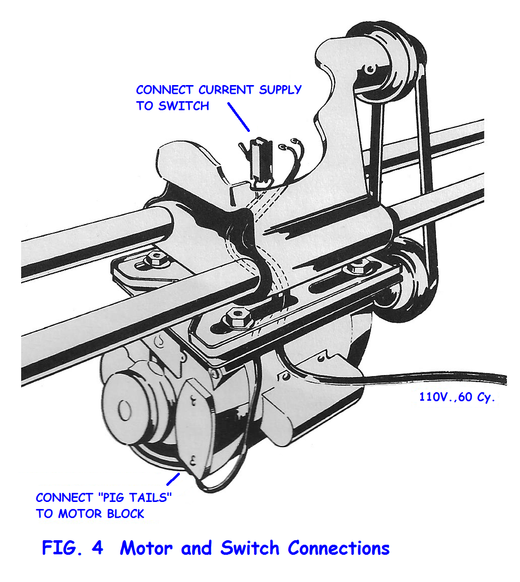
Fig 04.png
Fig 04.png (573.56 KiB) Viewed 4267 times
I have moved to PNG from the JPG format as each time I did a change, I got a color shift and bleeding with each revision, making corrections odd looking and color drifts between revisions. Hopefully PNG format will not exhibit that.
Post Reply