I don't want to cut off my ear, or my ER... but to ERR is human.
Thanks for everyone's input, and I have had some folks here looking at it as well. I am going with the 0,0,255 Blue as it has garnered by far the most comments on overall legibility with some color challenged folks.
It is going to take some time, but it will be similar in quality to the 10E I did earlier if all things go as expected.
Here's Figure 4 for example.
Everett
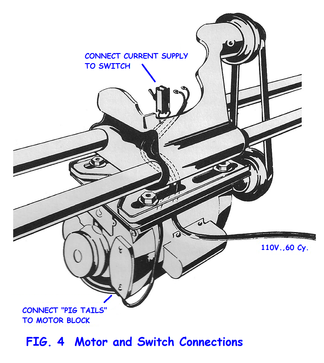
- Fig 04.png (573.56 KiB) Viewed 4258 times
I have moved to PNG from the JPG format as each time I did a change, I got a color shift and bleeding with each revision, making corrections odd looking and color drifts between revisions. Hopefully PNG format will not exhibit that.